Chic in 2016: Web Design Trends a la Mode!
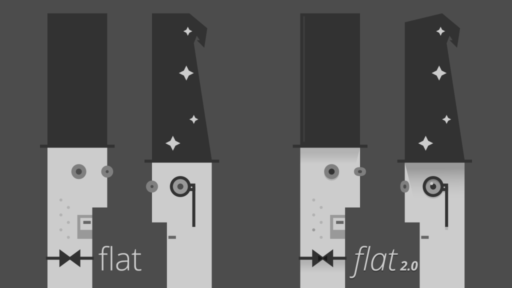
Last year, flat design walked the runway. This year, flat design is out and ‘almost flat design’ (aka Flat 2.0) is in!
What does that mean? While flat design is effective in terms of supporting usability and user navigation because it’s simple and clean which makes it easy for audience to identify the main message, buttons, menus, etc, it’s not as visually appealing. Flat 2.0 preserves the simplicity of flat design yet giving it an attractive edge.
source: dappergentlemen.com
What else is in trend on the web design front this year? Let’s go through some of the notable ones here.
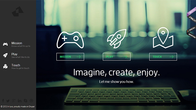
Ghost Buttons
While ghost buttons have been around for a while, the use of these buttons in web design is only going to increase in 2016. Not only do ghost buttons preserve the overall design, they do not distract visitors from the main content. In the past, flashing and disruptive buttons were in-trend. Today, simply put, anything native is in trend and more appealing for the web audience.
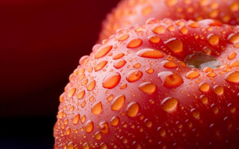
HD Images
You simply cannot go without HD (high definition) anymore. While HD images may be heavy to load, used wisely together with flat design, which is relatively light weight can have a powerful impact. A simple but high definition image gives the audience a positive feeling that gets associated with your website.
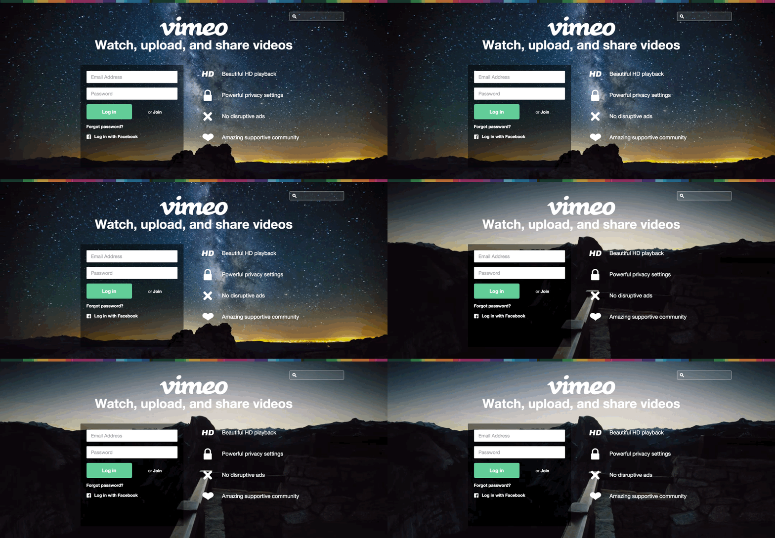
Background Videos
Background videos have been around since 2015 but will continue to be the central point of a website’s entire design strategy in 2016 as well. As easy as it may sound, it’s actually quite difficult for the web designer to create and select the right video that represents the brand’s website; choosing the right colors, mood and tone, video content and so much more.
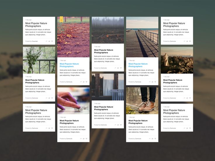
Card Design
Inspired by Pinterest, many designers use the concept for web design projects. On the plus side, the majority of users are already familiar with the design from using Pinterest, hence the learning curve in terms of usability is minimal, making the card design even more popular. The card design meets two of the main criteria for a good web design: visually appealing and highly functional.
Key takeaway? In the end, you don’t want to just be following trends because they’re ‘hip’ at the moment. While popular trends are there for very good reasons, they may not be the best reasons for your website. In terms of online user behavior, it’s recommended to always put user experience and website load time as a priority.
