
A Fast-track Guide: Responsive Web Design
Want to design a responsive website? Assuming you already know what a responsive website is, here’s our quick guide on how to easily go about it.
Start From Small to Large
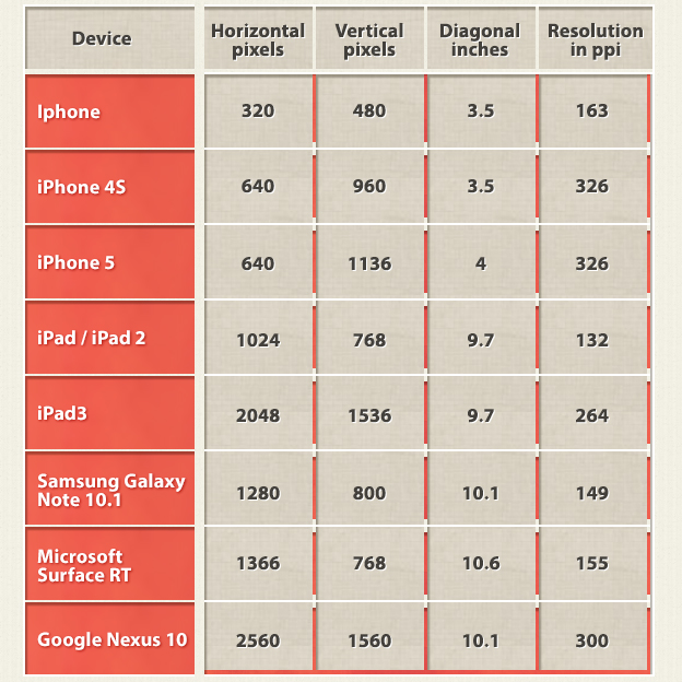
List out all the devices you want to optimize you website for. Then start designing starting from the smallest screen first.
Use the Grid System
Instead of measuring your website in pixels, switch to the grid system which is about taking a percentage view of the screen. The main reason to take on this perspective when designing is that the width changes depending on different browsing windows, hence ‘responsive’ design. Take note that it’s not possible (or would be extremely difficult) to design a responsive website without the use of the grid system.
Simple Navigation Design
Design the site’s navigation as simple as possible. Menu design should be as simple, with maximum of 2 levels for multi-level menu. This is to optimize both the design and development part for an error-free responsive website.

Think in Modules
Take on a modular viewpoint on the different parts of your design. Instead of seeing them as a whole, treat each part separately and imagine being able to split, re-size and shuffled the parts easily to get different layouts without negative impact on the overall page design.
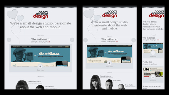
Think Fluid Design
A fluid grid is design in terms of proportions. The benefit? When the layout gets squeezed into small mobile screens, all the elements within the layout automatically re-size their widths in relation to each other keeping the page looking intact and error-free. The same idea is applied for larger screens.
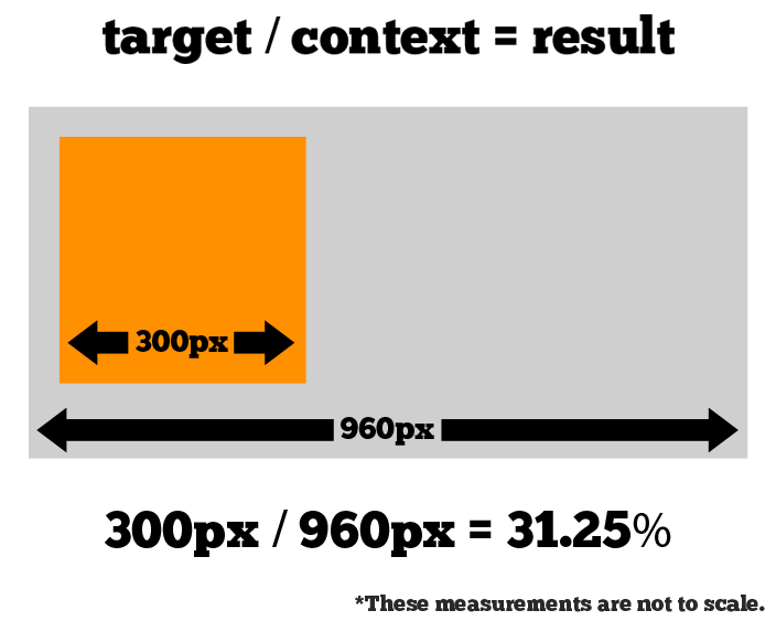
Next, let’s take a look how to go about proportion calculation for each element. One of the better ways to do this is to create a high fidelity mockup in Photoshop or any other pixel-based editor. Then, measure the page elements and divide it by the full page width. Start by defining what your ‘container value’ is. This is basically how many pixels wide for your entire page layout. Now take a look at one of your elements. If your container value is 960 and your element is 300 pixels wide, then ratio-wise, your element is 31.25% of the full width. The math: (300 pixels/960 pixels)x100 = 31.25%
There you go. A quick and simple guide for designing a responsive web.