
8 Best Practices for A High Converting Landing Page
A landing page is all about a clean website and presenting itself on a professional (or semi-professional) levels. There are many types of landing pages around and they all share the same concept: All landing pages are designed to help the user find what they’re looking without going out of their way to do so. These pages are based on intricate (but not messy) coding and intuitive design.
Optimizing Color: Color is more than just pretty shades and hues mashed together. Many websites conduct color-based research to determine what colors appeal to men and women. By understanding the psychology of color for business, brands have designed their websites in order to tap into their consumer’s color preferences and to keep them interested. Determine what types of colors clash or contrast each other.
Color evokes all sorts of emotions, depending on the type of service or product it will offer. Blue, for example is the color of truth, honesty and strength. The two biggest social media giants (Facebook and Twitter) use blue to represent their brand. Do you think it’s a coincidence? Certainly not!
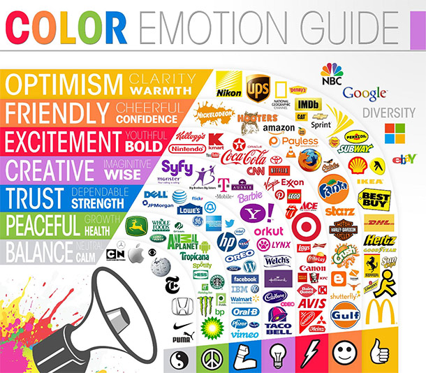
Image credit: Entrepreneur.com & Getty Images
Remove Distractions: It’s all about minimalism nowadays. That means, keeping it simple and clean. A website with too many distractions is bound to have high bounce rates. Elements such as flash banners and unnecessary gifs devalue the credibility of your website. Best practice is to remove all types of distractions so your audience’s eyes can fluently travel across your page easily.
One Call to Action Button: Sometimes there’s an element of overdoing it. Sure, you would like to sell your product but having too many ‘Buy Now’ buttons can scare away potential customers. It’s recommended to have only one CTA button on a single page. Like color, the CTA button must stand out from the rest of the website. For example, a dark-themed website may include a bright CTA buttons: Red, orange, green or blue but certainly not white or grey. Your CTA button should also be supported by relevant content as well… Or in some cases, arrows to guide your audience where to click!
E-Commerce: Avoid causing a headache to your audience by omitting registration steps when adding products to cart or checking out. Make check-outs as simple as possible.
Content Matters: Although your landing page needs to be visually appealing, the content that goes with it needs to be equally relevant. Avoid duplicate content, low-quality content and be clear on what your website is about. For example, if your website is about selling cakes, don’t introduce topics that aren’t relevant to your niche. Sure, you can extend into posting about baking utensils and equipment, frosting techniques but certainly not about how to gain 20 pounds in a week! Keep it your content relevant and fresh. Best practice? Update often but not too, too often.
No More Messy Codes: It’s a real pain when trying to code according to the proposed design. Keep the coding clean and structured. With the introduction of HTML5 and its smart tools, coding has evolved to become much more simplistic. If you need help with designing a website, why not try out WordPress’s premium themes? Many of the themes are minimalist in style and color. Plus, many designs nowadays are responsive so you don’t have to worry about your website appearing distorted on mobile phones or tablets.
Sharing is Caring: In the expansive world of the internet, word travels fast thanks to social media. It’s a good practice to integrate social media buttons onto your landing page so you can share it. Your social sharing buttons should be located above the fold or at the bottom of posts.
Trust: A website is all about trust between your brand and the potential customer. Create a sense of trust by including testimonials, success stories or even trust badges on your landing page. Avoid cluttering your page with certification stamps and add a couple of stamps at the top of your page and several stamps at the bottom. Websites with authentic privacy certification stamps or testimonials from credible websites allow the audience to feel safe and secure.
In conclusion, the advised tips are aimed to help you create a smart, flexible and credible landing page that can minimize bounce rates and boost your website’s conversion rates. If you’re unsure of what works and what doesn’t, consider implementing A/B testing tools to determine what design ‘rings’ well with your customers.
It’s all about trial and error but once you get the hang of it, your landing page would be in fact, converting nicely for years to come!